Over 11 courses and 122 hands-on labs, I have been fully equipped to process, analyze and visualize insights extracting from 65,000+ rows of data. During that journey, I have acquired many skills from cleaning messy data to uncovering patterns, building interactive dashboard and telling a convincing story with those insights.
Tools I have acquired:
-
Data Visualization & Analytics: IBM Cognos Analytics, Google Looker Studio, Excel (Advanced Dashboards & Pivot Tables), Power BI
-
Programming & Data Processing: Python (Pandas, NumPy, Matplotlib, Plotly), SQL, Jupyter Notebook, APIs, Web Scraping
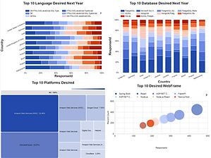
These are the interactive dashboards developed by Google Looker Studio using the cleaned data processed through Python in Jupyter Notebook environment. This experience teaches me to use appropriate charts for different kind of data to better convey its insight to the audience. Such as Tree Map for data such as market share, Word Cloud for keywords identification, Stacked Bar Chart for comparing more than 1 columns of data, Bubble Chart to compare frequency of a variable, etc... Click the headline to see interactive dashboards.


Below are the steps and codes I used to collect & wrangle data in Jupyter Notebook environment using Python programming languages:


These are the 6 steps in wrangling data automatically with Python programming language from load the dataset to explore its main characteristics then removing inconsistency, encoding categorical data to find regression, handling missing data in a column and normalizing data to ensure better accuracy for data in different range. This experience teaches me to handle any messy dataset before analysis and extracting any useful insights.


These are the steps in collecting data from website using API and web scraping. This experience teaches me how to collect secondary data more effectively and efficiently so that every decision made is based on various sources of data, avoiding biases and lowering stresses in collecting primary data from users